Display Home
The Melody 24 by Brighton Homes - Big Feel, Small Footprint
The Melody 24 delivers impressive space, style, and comfort for a compact 3-bed design — especially with its standout raked ceiling and thoughtful layout.
November 14, 2025
- Bedroom 2 with a walk-in robe, rare in a 3-bed
- Master suite feels premium
- Great flow and zoning for a compact design
- Extra sink in the pantry zone feels unnecessary, leads to being a bit overkill in this space
The Melody 24 is the kind of home that quietly surprises you. On paper, it’s a three-bed design aimed at small families, first-home buyers, or downsizers wanting something modern without stretching the budget. But in person - and especially walking through the display, it feels more generous, brighter, and more considered than you expect at this size.
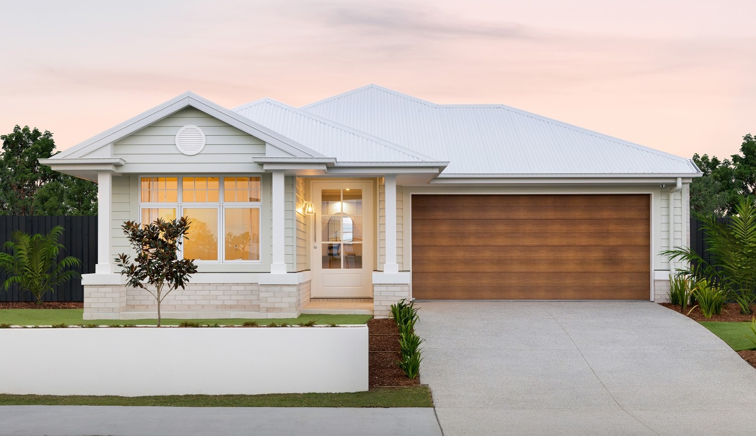
Even from the street, the Melody 24 sets a positive tone. The Nantucket facade colour is spot-on: warm, modern, and balanced without trying too hard.
Displayed at Kinma Valley, it reads as a home that really wants to maximise lifestyle over square metres.
Step through the porch and you’re greeted with a straightforward entry that immediately splits into the first bedroom zone.
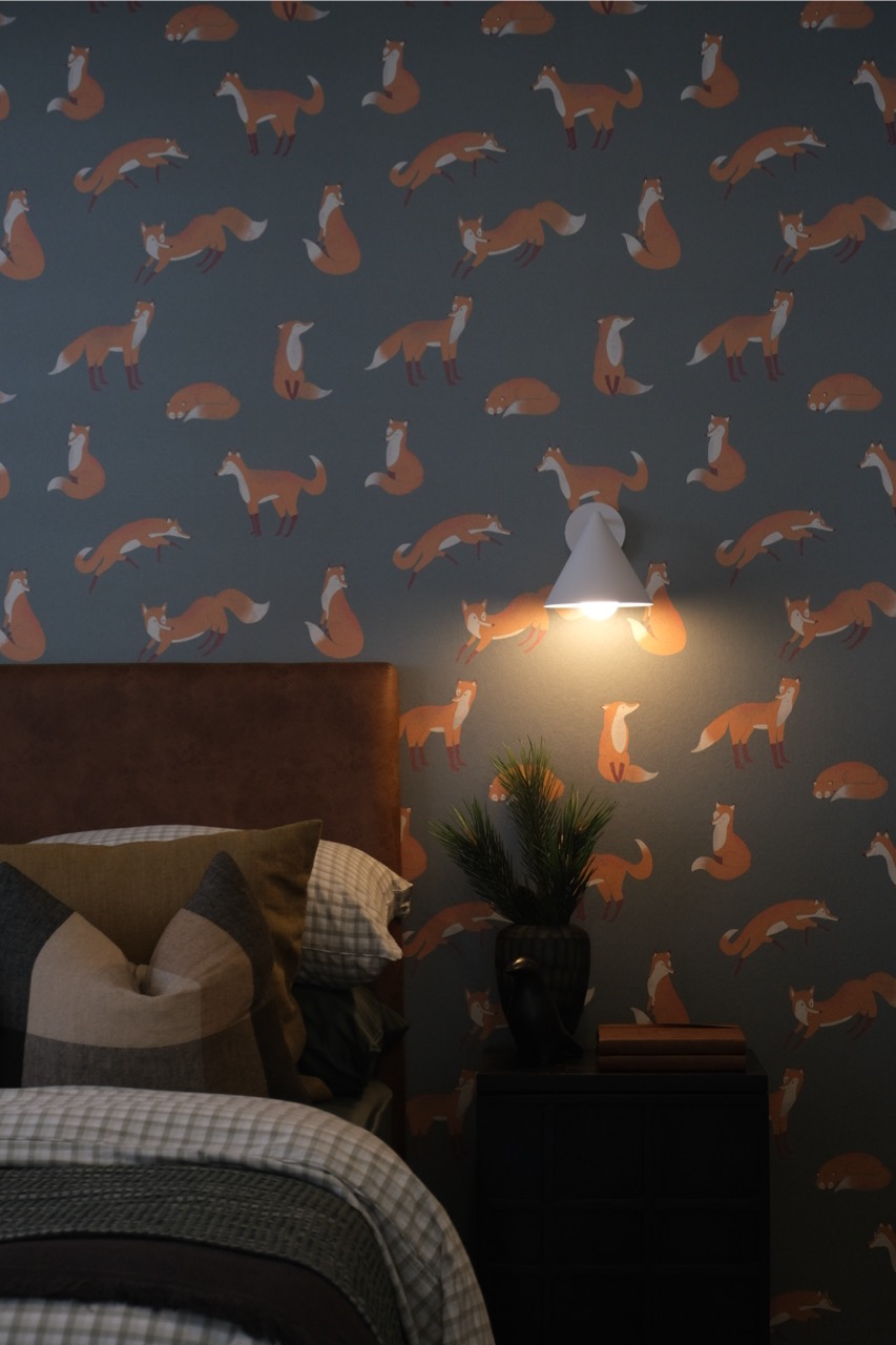
Bedroom 3, positioned right at the front, is styled beautifully in the display — the theme and decor give it an inviting, almost boutique-hotel feel. It’s not a huge room, but it works well as a kid’s room or guest space.
Directly opposite is the shared bathroom where everything fits, nothing feels cramped, and realistically, with only two secondary bedrooms, this bathroom won’t ever service too many people at once. For the home’s target market, it’s perfectly adequate.
Bedroom 2 sits just beyond this and is noticeably larger. There’s enough room for a proper desk setup, which older kids (or adults working from home) will appreciate. The bonus here is the walk-in robe - a rare and welcome feature in a 3-bed design.
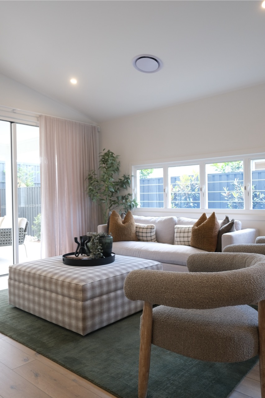
Moving deeper, you hit the entertainment room, which in this layout is a real asset. This is the perfect spot to house the TV, gaming consoles, or movie nights - meaning the main family zone can stay uncluttered. I did find myself wishing for a bigger couch in here, though; the space could definitely take it.
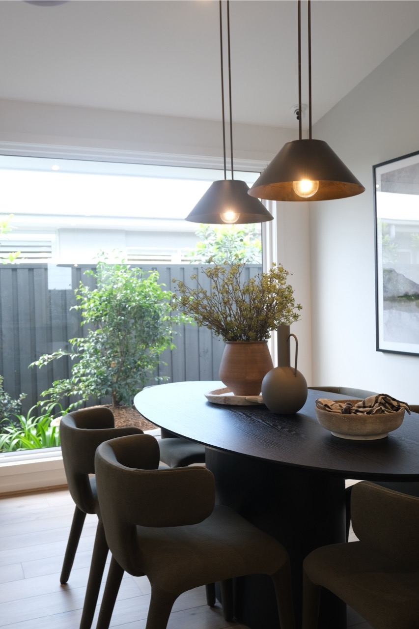
Then comes the heart of the home: the open-plan family, meals, and kitchen zone, highlighted by a raked ceiling that immediately lifts the entire space. It feels bright, airy, and genuinely expansive. You don’t often get this sense of volume in a 24-square plan.
This area is roomy enough that I’d personally skip mounting a TV here and keep that for the entertainment room - let this remain a clean, social, family-focused hub.
The kitchen is nicely appointed with a wide island and plenty of usable bench space. Behind it is what I’d call a semi–butler’s pantry: a walk-through zone with extra storage and… a second sink.
Now, here’s where things get a bit puzzling.
You’ve got:
A little unusual, because secondary sinks are usually tucked away out of sight to hide prep mess — whereas this one is much more visible from the main living area.
The good news? This space could easily be reimagined as a coffee bar, appliance centre, or wine nook — something fun that adds character, and you don't have to built it like this when you're building it your way!
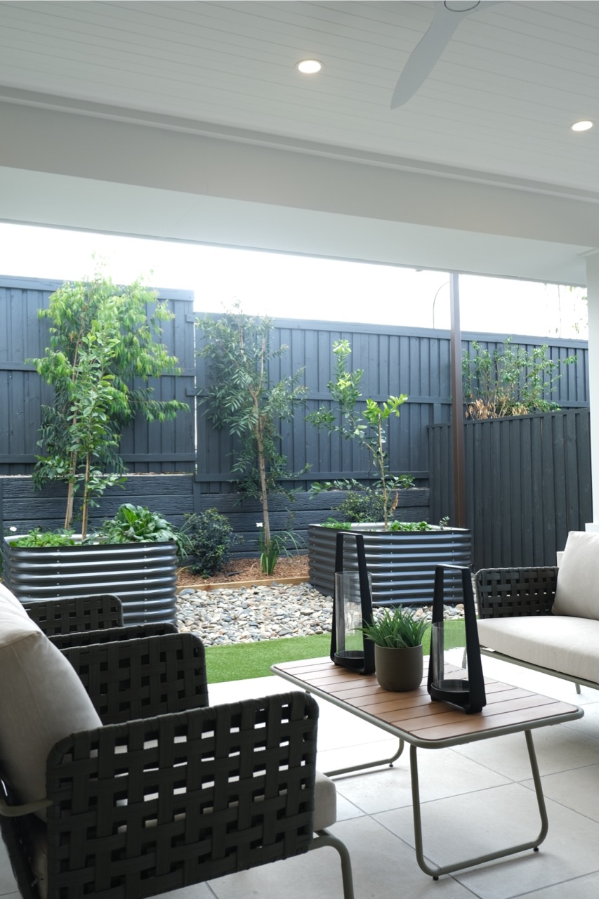
The laundry behind it is compact but fine for a small household, with decent access and good proximity to the outdoor area.
The master suite sits privately at the rear, a layout choice most buyers prefer. It’s a strong finish to the plan with:
It feels calm, modern, and grown-up — exactly how a master suite in a smaller home should feel.
Brighton Homes often leans into warm, contemporary styling, and the Melody 24 display really shows this off. From the earthy colours in the secondary bedrooms to the consistent green accents, the palette feels modern and homey without being trend-chasing.
The raked ceiling, feature cabinetry, and facade colour all feel elevated — a clear sign that this home delivers value without looking entry level.
Walking through, the home feels balanced. The front zone is cozy and functional, the centre zone has that lovely sense of lift from the ceiling height, and the rear master suite gives you privacy and breathing space.
Natural light is solid throughout thanks to the long, linear layout and the way the windows flank the main living area.
The Melody 24 gives you a lot of home for a modest footprint. While there are quirks in the service areas, the overall liveability — especially in the main living zone — is impressive. With its strong street presence, thoughtful zoning, and a master suite that feels genuinely elevated, it’s a design that delivers solid value for young families or downsizers wanting comfort without excess.
If you want a three-bed home that still feels like a lifestyle upgrade, the Melody 24 absolutely deserves a spot on your shortlist.